It’s been a long time since I posted a blog. Coupled with a major overhaul of my website, I thought it was high time I got back into sharing my thoughts on materials.
It’s easy to lug round the ‘Kitchen sink’ when you go out sketching. However, I’ve found limiting the kit I take with me to be a liberating and educational experience.
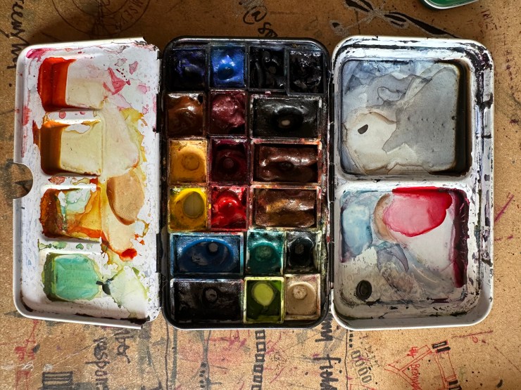
This is my regular travel palette developed from the great work done by Liz Steel. It currently contains nineteen colours. I know this palette very well and it allows me to add colour to sketches without thinking too much about mixing and colour theory. They are not a chore to carry with me, but I wondered what could be achieved by limiting my colour choice to primary and secondary colours. It is obviously a lot easier to get to know a new palette if it has fewer colours in it. There is a wealth of information available from manufacturers and other artists who have spent a great deal more time and research into colour theory. I will mention Daniel Smith, their website contains a huge amount of information on colour theory and Jane Blundell. Jane’s website and blog is another invaluable resource for me, I recommend it highly.
It is probably a good idea to start with a definition. From the DS website, Primary colours — are hues that cannot be mixed from any other colours– red, yellow, and blue – from these primaries, most other colours can be mixed. I thought three primary colours might be taking things too far, but Jane talks about the split primaries in one of her blogs. One cool and one warm version of each primary colour.

The split primary offers the best of both Red Yellow Blue (RYB) and Cyan Yellow Magenta (CYM) colour models. From left to right, top to bottom:
Hansa Yellow
Lemon Yellow
Pthalo Blue (Green shade)
French Ultramarine
Quinacridone Rose
Pyrol Scarlet

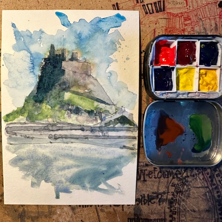
I’m not entirely sure why I was so surprised, but look at the variations and options in that grid. Using a subject I go back to on occasion, I tried the palette out on a small sketch of Lindisfarne Castle. You can see the primaries are blended to produce some rich secondary colours.
Looking for an alternative six colour palette, the logical step is to add paints which represent the secondary colours.
Secondary colours are the resulting hues of mixing two primaries in equal amounts.
Red + Yellow = Orange
Yellow + Blue = Green
Blue + Red = Purple


I used the CYM colour model coupled with orange, green and purple. From left to right, top to bottom:
Yellow: Lemon Yellow
Green: Pthalo Green (Blue Shade)
Cyan: Pthalo Blue (Green shade)
Purple: French Ultramarine
Magenta: Quinacridone Rose
Orange: Pyrol Orange

Again, you can see the wealth of variation in colours which can be produced. It is probably only personal preference, but I found the secondary palette produced a range of colours I would be more likely to need in landscape sketches.
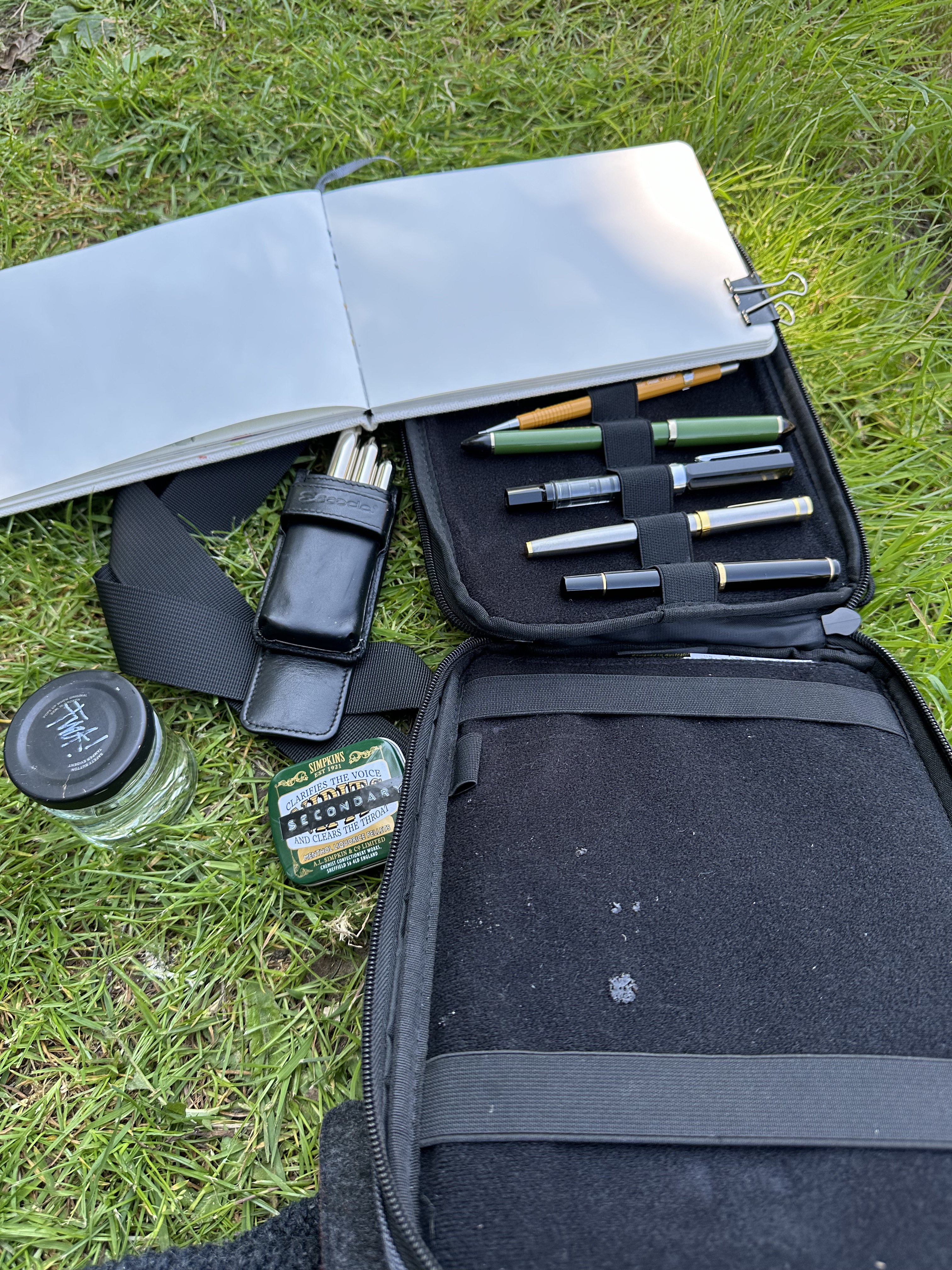

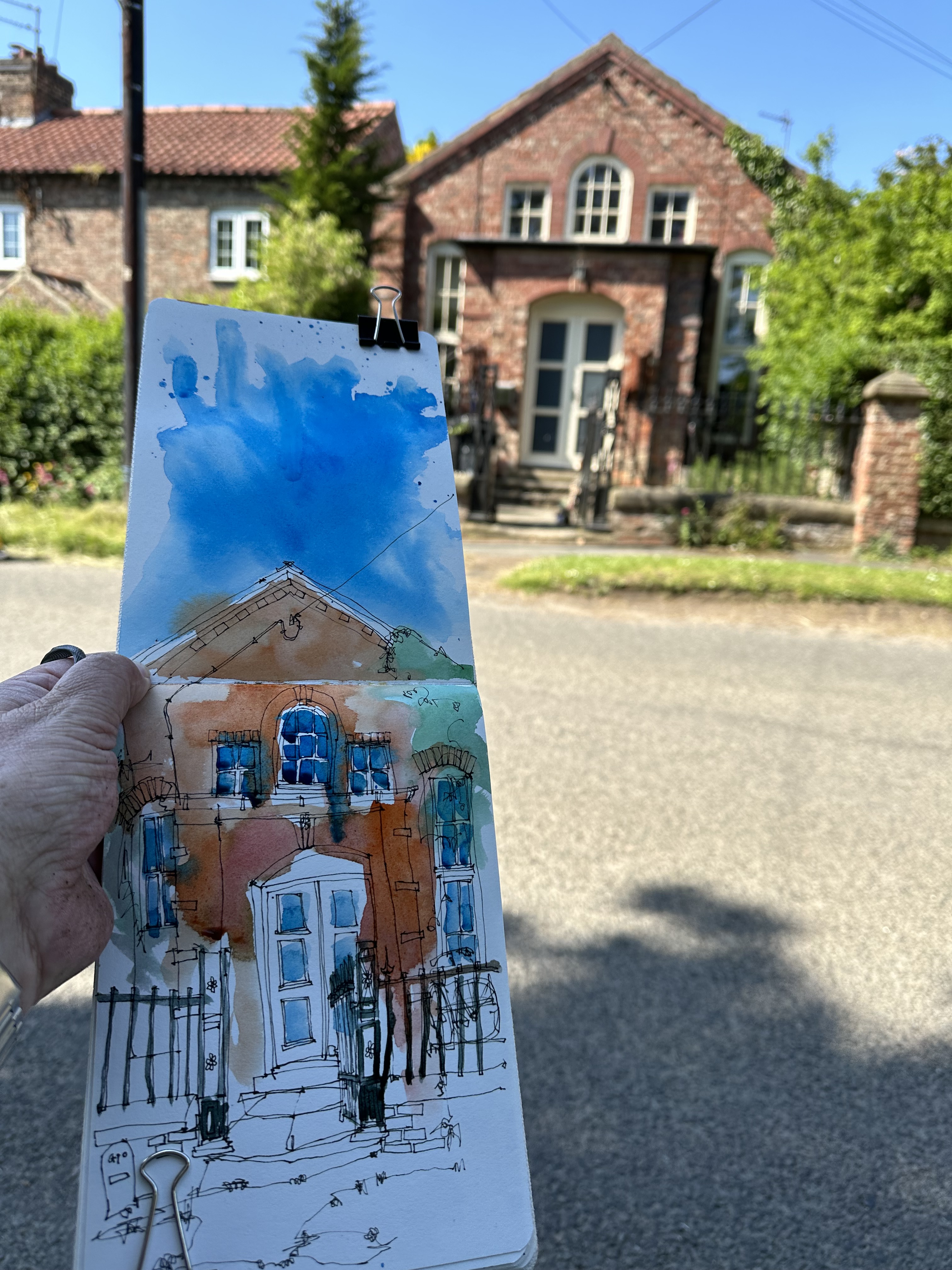
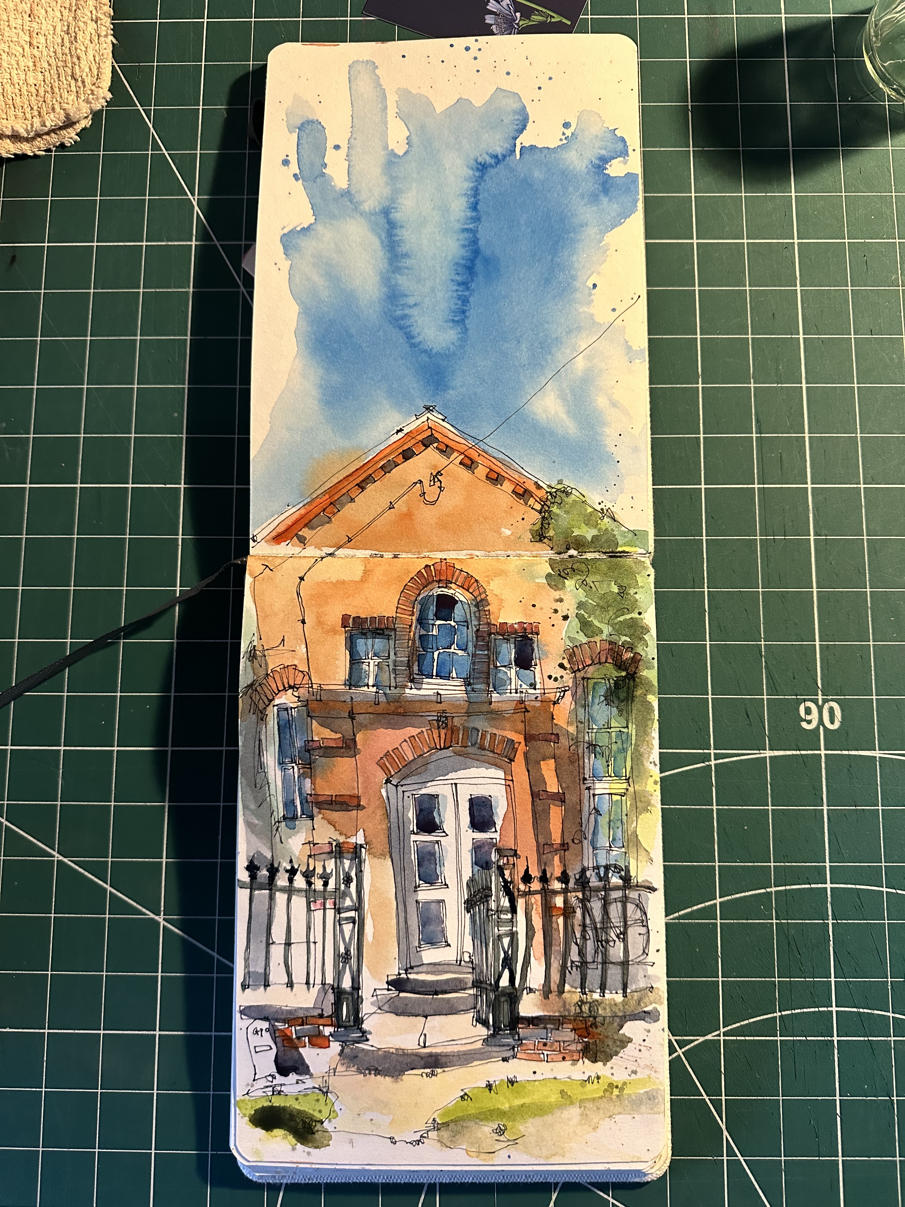
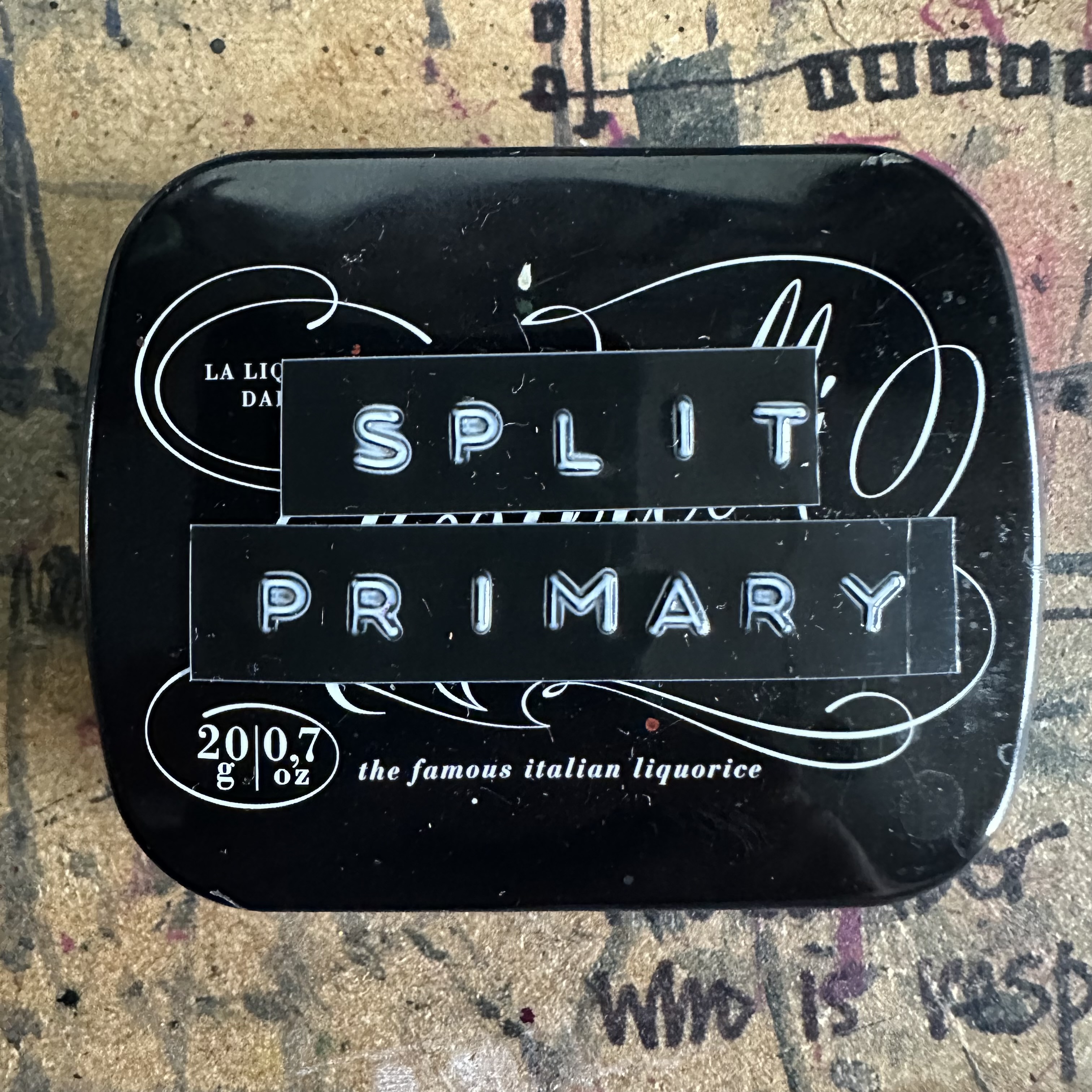
Here you can see my pared down travel kit including the secondary palette and the colour added to a sketch of the Old Chapel in Little Ouseburn, North Yorkshire. The only downside is the tiny liquorice tins, whilst being very cute, don’t offer much in the way of space for mixing. There is a lot of mixing, and experimenting, especially in the early life of the new palettes. I did have a white ceramic tile with me for mixing, but I kept it out of shot for some reason.
In conclusion, I would suggest you look at the colour theory information which is widely available. If you are looking to reduce your palette or simply restrict how much money you spend on paint then a primary or secondary palette is a great place to start.
I used colours from the Daniel Smith’s range, but there is nothing to stop you producing your own primary or secondary palettes with W&N, Schminke or any other manufacturers’s paints. Enjoy experimenting.

wow!! 85Primary and Secondary Palettes
LikeLike